Thornton Group
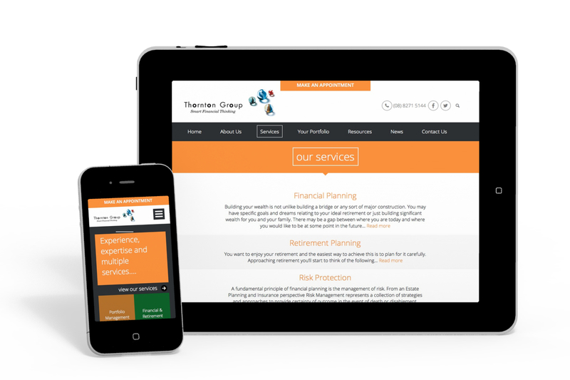
Thornton Group wished to update their website's look and feel. Working with a new design created by Scott Hutton of Twenty20 Graphics we developed a full mobile responsive system, rich with style features.
Attributes
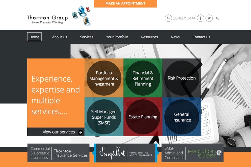
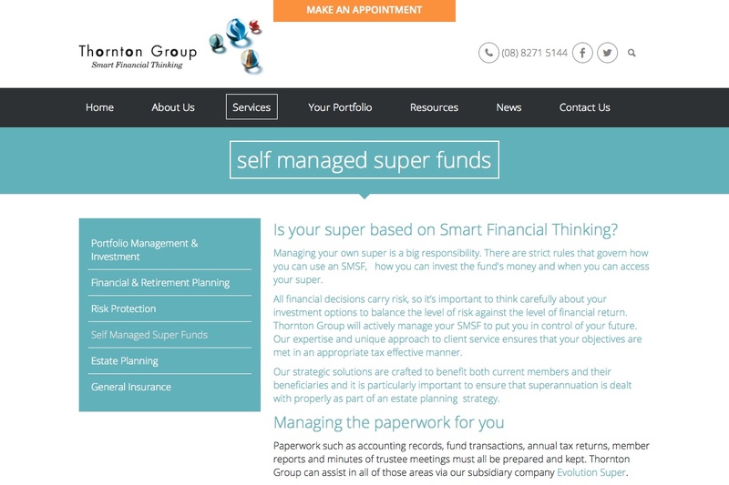
Scott Hutton's design featured a variety of text layouts, including centred text styling, grey alternating bands down pages and colour adaption to highlight different sections of the site.
Alternating bands
Each page of the site features strips of grey and white alternating down the content. We developed this so that a page attributes controls how many alternating bands are displayed on the page, outputting appropriate editable areas. We'll be talking about this handy mechanism in a future blog post.
Design colour attributes
The Services section of the site features different colour schemes for each service, giving them all a unique feel. These colour selections are managed via a colour attribute, set per top level services page. Behind the scenes, we used some clever features of our preferred CSS pre-processor, Sass, to make theming these different areas trivial. We could for example, add in an extra colour to the site simply by adding a colour code to a list in our Sass file - Sass loops through a list of colour codes and outputs the appropriate CSS for the various page components. (Have we mentioned how much we love Sass?)
File Attributes to add files to pages
There is also an attribute which places files into the top banner of a page, but when no file is selected the banner does not display.
Interactive Team Member page
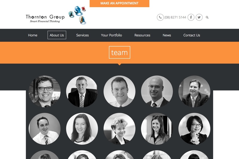
The Team Members page includes multiple interactive features. Black and white profile pictures are displayed that change to colour and include a hover box on roll over. Clicking on a member profile pic scrolls you down the page to view their full details (with the content dynamically loading in).
The content for each team member is composer driven, making the addition of new members and the update of member profiles easy to achieve.
We have also included our Edit in Composer button to short cut the editing process.
Interestingly, each profile image only needs to be uploaded in colour, as a square image - we used both border radius and filter CSS properties to dynamically create a round image and turn it greyscale. On hover, we remove the filter, revealing the colour image.
Our Sass/SCSS for this effect looks a bit like this:
.image-thumbnail{
	img{
		border-radius: 1000px;
		margin-top: 15px;

		filter: url("data:image/svg+xml;utf8,<svg%20xmlns='http://www.w3.org/2000/svg'><filter%20id='grayscale'><feColorMatrix%20type='matrix'%20values='0.3333%200.3333%200.3333%200%200%200.3333%200.3333%200.3333%200%200%200.3333%200.3333%200.3333%200%200%200%200%200%201%200'/></filter></svg>#grayscale"); /* Firefox 3.5+ */
		filter: grayscale(100%); /* Current draft standard */
		-webkit-filter: grayscale(100%); /* New WebKit */
		-moz-filter: grayscale(100%);
		-ms-filter: grayscale(100%);
		-o-filter: grayscale(100%);
		filter: gray; /* IE6+ */
	}

	a {
		&:hover,  &.active {
			img {
				filter:none;
				-webkit-filter: none;
				-moz-filter: none;
				 -ms-filter: none;
				-o-filter:none;
				filter: none;
			}

		}
	}

}
Other features
Mobile Responsive - The whole site is fully mobile responsive. The homepage displays this aspect most, which the coloured box graphics re-flowing to display optimally at different sizes.
Scrolling Contact Button - The top 'Make An Appointment' button moves down the page as you scroll, keeping this contact point in the forefront of the site at all times.
Styled File Button - file links are styled as orange blocks to match the site. Grey background fields behind Newsletter download files are also styled.
Subscribe to our Newsletter - a specific form has been included to sign up for newsletters, this features some extra validating Javascript for usability.
Contact Forms - multiple contact forms for 'quick quotes' have been styled to match the site, section and to be fully mobile responsive.
Visit the Thornton Group website


